Pantone describe their colour of the year: ‘Very Peri’ as having carefree confidence and a daring curiosity that animates creative spirit. This colour can add joy to any home with its bright and daring tone, it will also add a contemporary feel to any room. This is a guide on how to add Very Peri to your kitchen or bathroom and how to perfectly style it with Tile shed products.
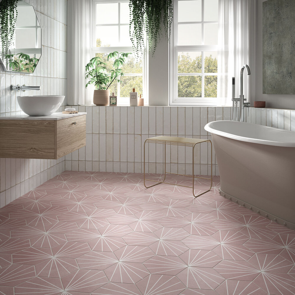
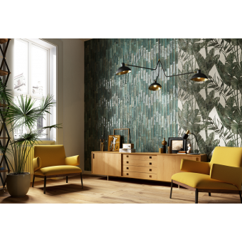
Balancing such a deep, cool colour in the home can be tricky, but pairing it with a complementary palette of colours with a natural balance of warm and cool tones can be a way of creating colour harmony. Colours such as muted pink tones and pastels can be the perfect way to create this balance. An alternative approach is creating a colour story Pantone call amusements, exploring bright irrepressible fun colours that complement Pantone’s colour of the year’s more carefree and fun side. Colours such as bright oranges, teals and flamingo pinks will work to create a fun and playful space. As well as this, Pantone’s other colour guides show how well green tones pair with Very peri to create a more natural balance and black, brown and white tones make the colour stand out in any home.
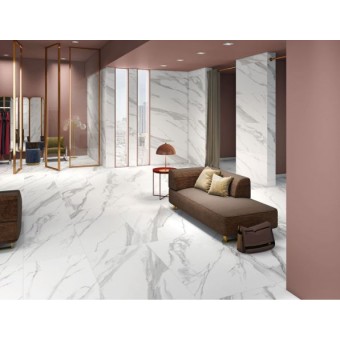
Very Peri is said to encourage inventiveness and creativity, which makes it a perfect colour for those that get creative in the kitchen. With it being more of a cool tone, it could be seen as an untraditional kitchen colour, with kitchens tending to be more neutral. But if you’re feeling creative and daring, it will make add a show-stopping addition. There are many ways for you to style the colour in the kitchen, for example, all walls painted or one feature wall, but it is important to think of how to style the rest of the room based on your decision and to consider the size of the space. If you decide to paint all the walls, then having bright, light kitchen floor tiles could help your space look larger. Our Straturio Blanco Polished tiles have a subtle marble look that will lift the room and give an element of luxury, especially with matching counters. You could even play with bringing the tiles up onto the wall for splashbacks to give a modern finish.
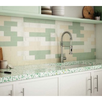
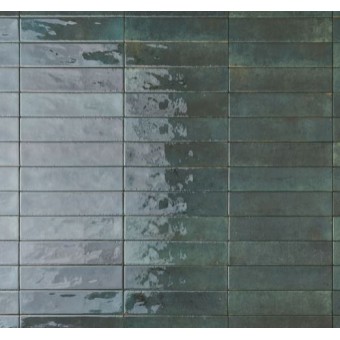
A splash of our country mist green wall tiles would compliment Very Peri, pairing them with a mixture of white worktops and white country Blanco tiles to keep a neutral balance. This mixed with textures and elements of natural wood will create a cottage kitchen feel. Adding something a little different such as the Verona Hope Rose kitchen wall tile in ceramic gloss, will compliment Very Peri in any part of the kitchen, especially if painted onto the cupboards. This splash of subtle colour will work perfectly with the bold purple tone and allow you to introduce more neutral tones such as white and light greys for accessorising.